On July 31st, my solo show, Hiatus, will open at China Heights Gallery in Sydney. The exhibition will feature a set of new black and white illustrations and a large-scale mural. While I have been developing ideas for the show over the last 6 months, the majority of the drawings will be finalised within the next 3 weeks. Most of my studio time is spent working as a commercial artist, creating logotypes, illustrations, and type treatments for brands and advertising campaigns. So it’s both exciting and daunting to be able to dedicate my time to some personal work. Today, I’m going to share with you some of the early stages of ideation and development for this show, and the processes I go through before creating the actual work. Although the stages appear clearly structured here, in reality it can be disorganised and stressful! I’ll check in again closer to the show and give you an update of how it’s all coming together.
1. RESEARCH + IMAGE GATHERING
Gathering research, visual inspiration and ideas is an ongoing practice in the studio and while I travel. I am constantly screen grabbing imagery, illustrations, patterns, and photographs that are in some way appealing to me. Sometimes it’s specifically for a technique or approach, other times it’s more from a conceptual point of view. For this particular show (as with many of my works) I am working in black and white. Some artists whose work I love and who often feature in my collection are Jonathon Zawada, ilovedust, Luca Zamoc, BrokenFingaz, Jordan Metcalf, Japanese comic imagery, and vintage drop caps and letterforms. In addition to this I have many images or Art Nouveau lettering and decoration that I photographed while in Barcelona which will likely appear in some form in the work.
2. WORD COLLECTION
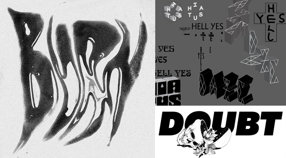
As I work predominately with letterforms, I am always collecting words or phrases that might translate well into a piece. I have a huge list stored of notes on my phone and computer: song lyrics, words combos, quotes, silly phrases or simply single words that look good. I prefer to work with shorter words/fewer letters so I can focus on integrating with illustration, and often I will make choices about which words to use in a work purely based on the visual appeal of the letterforms. A shortlist of favourites that may feature in this show are: “high noon”, “glory daze”, “june gloom”, “andromeda”, and “dynamite”. Sometimes the meaning and content of the text will play a role too. Although the significance of the text is important, I do think there is a space to explore type-based art that sacrifices meaning to allow for exploration of form, and that’s definitely a space I wanted to be open to in this show. Sometimes word selection will be driven by the shape of an illustration or another idea. For example, I was keen to see what word combinations could line up vertically and horizontally (like a crossword). After trying many combinations I had roughly scrawled Hell Yes, and realised that within a cross worked both on a visual level and a conceptual one – win win!
3. EXPERIMENTATION
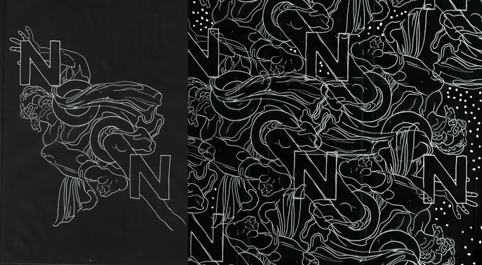
Before finalising the approach for this show I wanted to allow some time to freely experiment with some new hands-on techniques. I initially played with photographing liquids and paper cutting with shadows, which were then scanned into Photoshop and manipulated (see the BURN and DO example). However, I decided to abandon the liquid approach as it felt a bit too similar to some of Ed Ruscha and Jonathan Zawada’s work. I also decided to leave the paper cutting and shadow experiments for another project down the track. One early test that stuck with me was a quick line drawing of a stone sculpture I took a photo of in Rome last year. I had a list of words that were symmetrical (palindromes or words where the letter shapes made them symmetrical even if they weren’t the same characters). I took the word NOON and it seemed to integrate perfectly with this statue’s tragic pose. A happy accident. That was kind of the reference point for the rest of the pieces. Not focusing too hard on the content of the text- but just finding words or word combinations that are in some way symmetrical or integrate well with an illustration. It was at this point I realised I wanted all the works to be illustration-focused, where the type and image seem to sit together as one.
4. COLLECTING REAL OBJECTS FOR REFERENCE
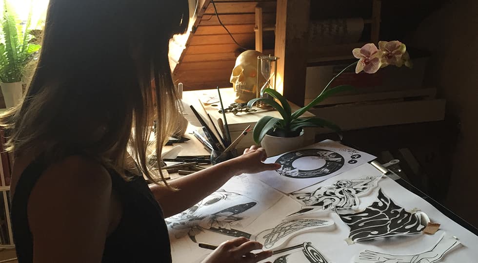
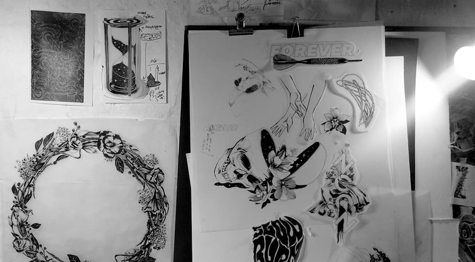
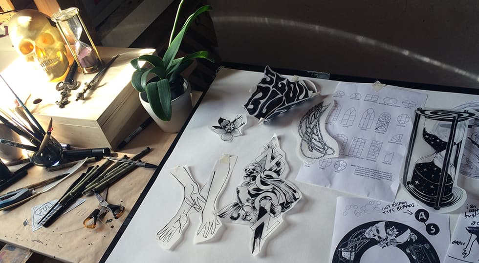
In addition to digital images that I collected for reference, I also wanted physical objects that were unique (not just pulled off the Internet) and would work as starting points for my drawings. I have a vintage scientific skull that I’ve wanted to draw for a while, but I also set off to some second hand stores to find other things that could be used for reference. At the moment I’m drawn to ideas and objects related to belief, death and time. I found an old hourglass, and some miniature daggers and letter openings from Spain. I also collected a variety of flowers and foliage to integrate.
5. PHOTOGRAPHY + DIGITAL LAYOUTS
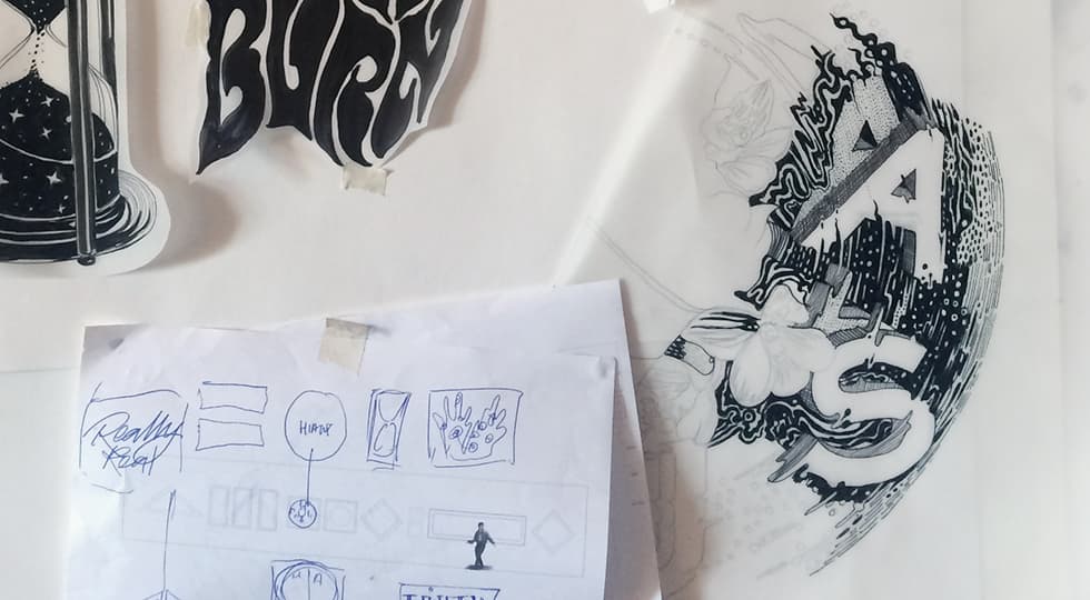
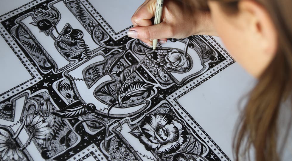
With a set of physical objects, I then spent an evening with fishing wire and a make-shift photo backdrop to photograph the various objects to refer to down the track. Around the same time I also began taking some of the words I’ve collected and playing with loose layouts with existing fonts in Illustrator to get a sense of how they might sit together in a composition. Using the 3D tool I will make really basic dimensional versions of these words to see how they might integrate with the angles of the photos I have taken. I currently have about 6-7 Photoshop compositions that I will return to and use to determine which will become a hand-drawn illustration. For the “Hell Yes” piece, I wanted to use Art Nouveau style lettering with floral elements to imitate the idea of a beautiful, intricate crucifix and soften the “hell’ connotation. I based the letterforms on the font Ulma and integrated new floral elements and set out to start the drawing.

6. DRAWING
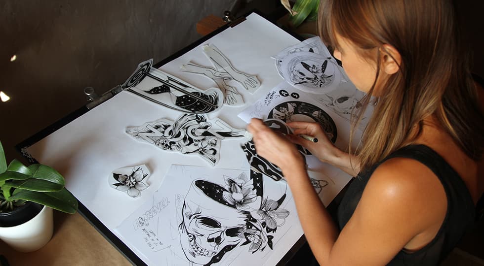
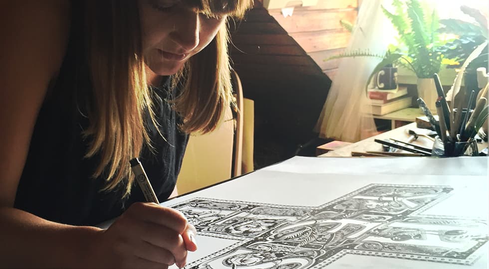
Using the digital layouts as my starting point, I move onto drawing in fine line markers. I start by doing some quick drawings of the objects to get a sense of how they might connect or work together with text. I often draw, scan, print and then redraw or cut them out so I can move them around like a collage on the page. Once happy with the composition, I move onto a final piece. This is my favourite part of the process because once I feel confident with the layout it can be quite therapeutic to spend some time away from the computer illustrating dots, lines and details of the works.
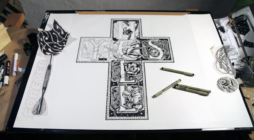
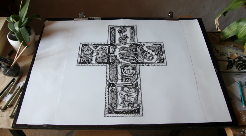
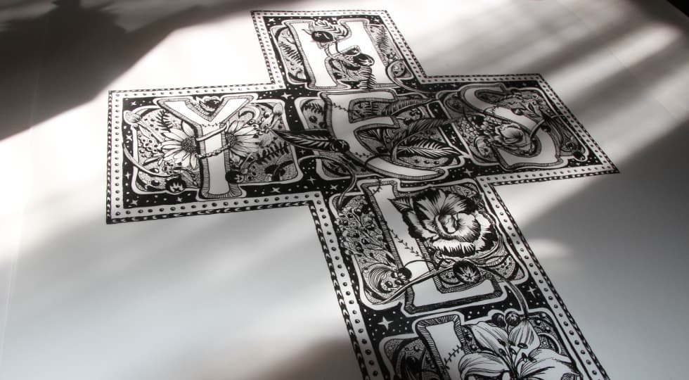
With only 3 weeks to go until opening night there’s still a huge amount of work to do. But, with the Hell Yes piece complete, I am happy with the direction of the show, and I’ll revisit the early steps in my creative process to produce the remaining pieces and mural.
I’ll check in again in a couple of weeks and show you how some of these early experiments have progressed. Stay tuned!
-Gemma


